Most landing pages fail not because they look bad, but because they were designed to look good rather than to convert. There is a big difference between a page that impresses visitors and a page that turns them into leads, buyers, or booked calls.
If your landing page is getting traffic but the conversion rate is low, the problem is almost never the offer itself. It is the page. Specifically, how it communicates the offer, how it handles objections, and whether it makes the next step feel easy and obvious.
This guide covers what high-converting landing page design actually looks like in practice, what elements drive real results, and the mistakes that kill conversion rates on otherwise good pages.
What a Landing Page Is (and Is Not)
A landing page is a standalone page built for a single, focused purpose. There is one goal, one audience, and one action you want the visitor to take. It is not your homepage. It is not a general services page. It is not a place to tell your whole brand story.
The focused nature of a landing page is exactly what makes it effective. Every element on the page, the headline, the layout, the images, the copy, the CTA, should support one decision: yes or no.
The Anatomy of a Landing Page That Converts
High-converting landing pages share a consistent structure. The order and execution matter, but the core building blocks are the same across industries.
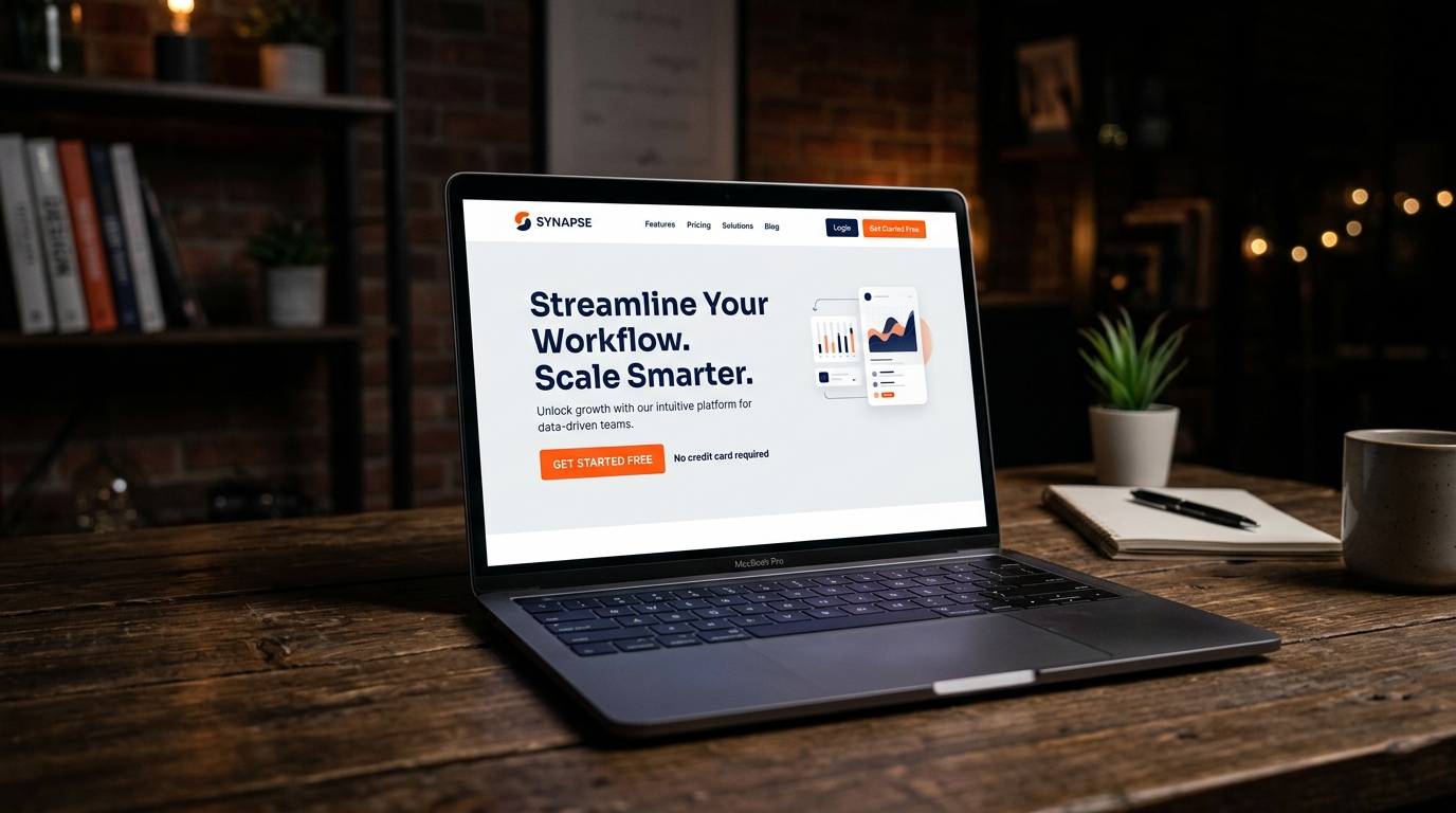
1. A Headline That States the Outcome
Your headline is the first thing every visitor reads. It has about three seconds to convince them they are in the right place. The best headlines do not describe your service. They state the outcome the visitor wants.
Not: “Professional WordPress Website Development Services”
Better: “Get a High-Performance WordPress Site That Loads Fast and Converts Better”
The visitor cares about what they get, not what you do. Write your headline from their perspective, not yours.
2. A Supporting Subheadline
The subheadline sits directly under your main headline and adds context. It is where you can mention who this is for, what makes your approach different, or add specificity that the headline kept short for impact.
3. A Strong, Clear Hero Section
The hero section is the above-the-fold area of your page. Everything a visitor sees before they scroll. It needs to communicate the value, show what they are getting (or the outcome they are buying into), and present a clear next step. Cluttered hero sections with too many elements dilute the message. Keep it focused.
4. The Primary Call to Action
Your CTA button should appear in the hero section and repeat at strategic intervals down the page. The text on the button matters more than most people realize. Generic text like “Submit” or “Click Here” consistently underperforms compared to specific, outcome-focused text like “Get My Free Audit” or “Start My Project Today.”
5. Trust Signals Early
Visitors arrive with skepticism. They do not know you yet. Trust signals placed near the top of the page reduce that friction before the visitor gets deep into your content. Client logos, review scores, certifications, or a quick stat like “50+ brands served” all serve this purpose.
6. Benefits, Not Features
Features describe what you do. Benefits explain why it matters to the visitor. “We use custom-coded WordPress themes” is a feature. “Your site loads faster and is easier to manage because we write clean, bloat-free code” is a benefit. Always write for the benefit first.
7. Social Proof
Testimonials, case studies, and real results from past clients are some of the most powerful conversion elements on any landing page. Video testimonials outperform text, but even a short quote with a real name and company adds credibility that your own copy cannot provide.
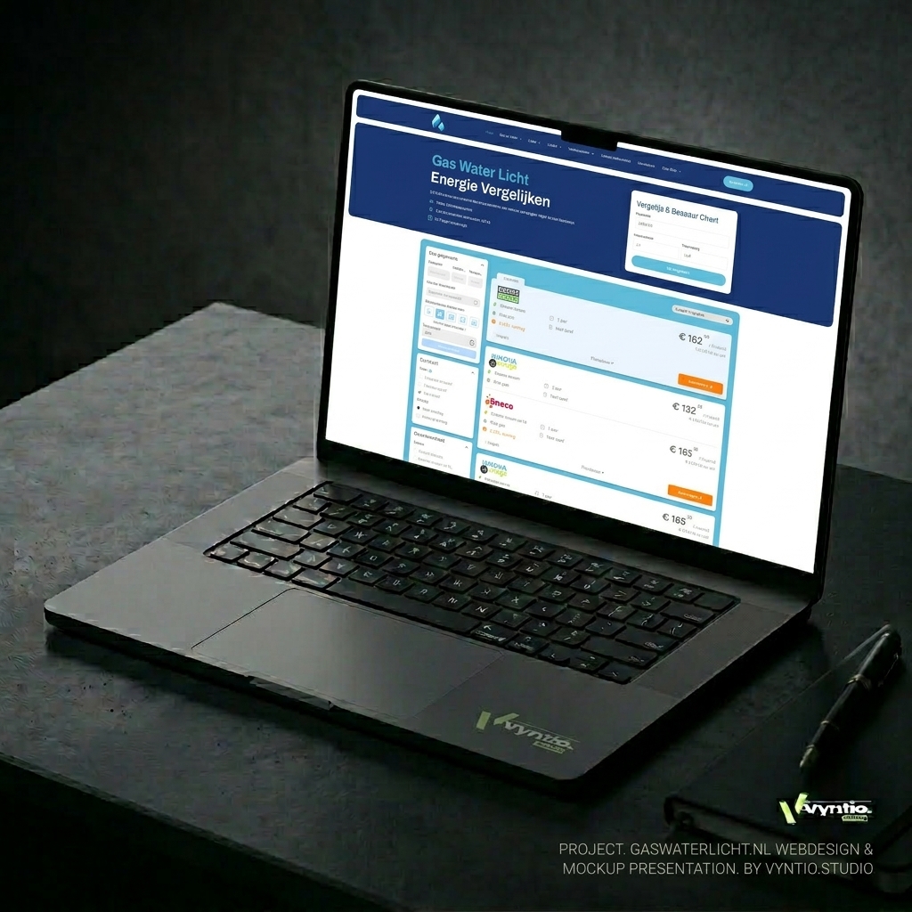
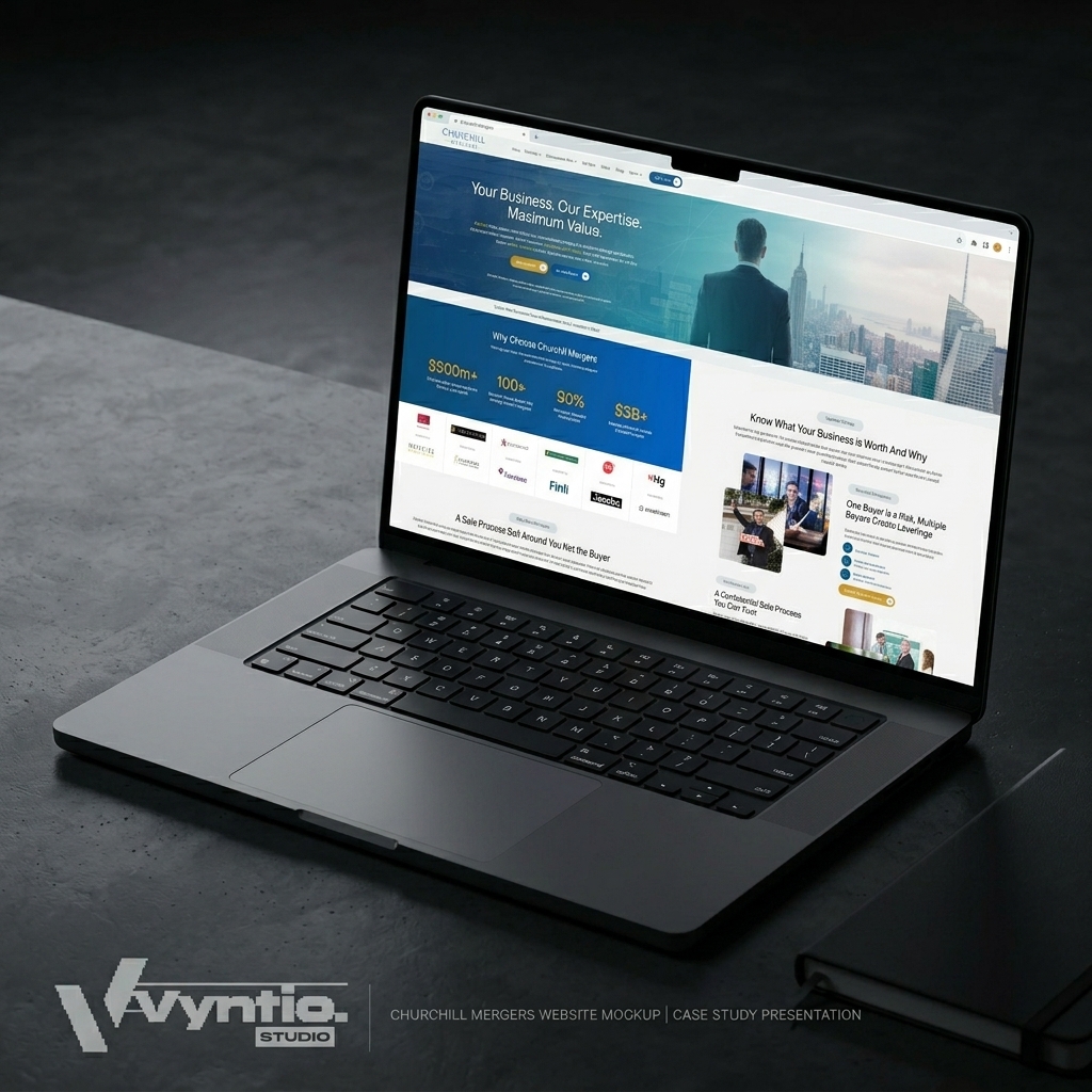
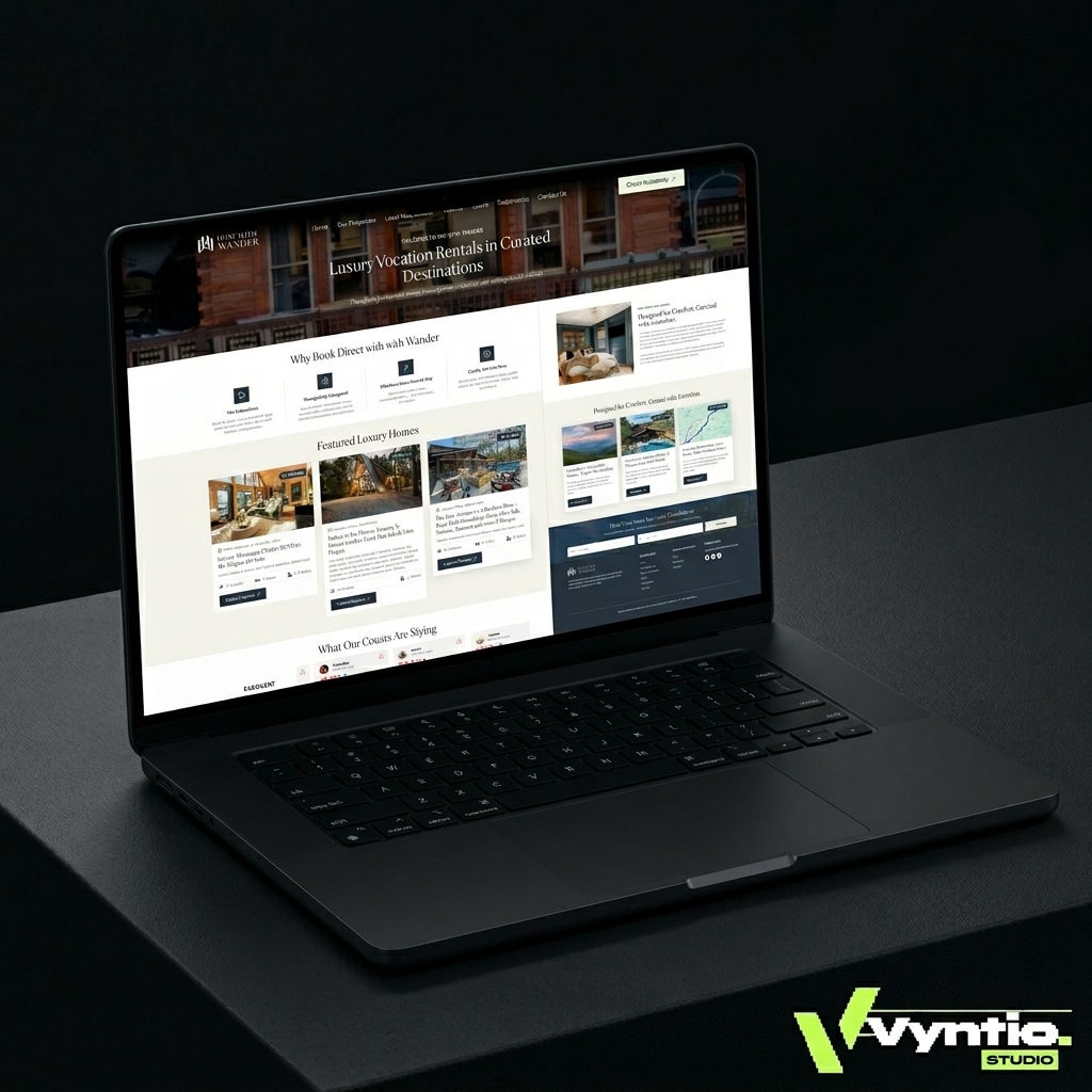
At Vyntic Studio, we document real results for every project, including speed scores, SEO improvements, and client feedback. You can see examples in our portfolio.
8. Objection Handling
Every visitor who does not convert has a reason. Price uncertainty, timeline concerns, trust gaps, or confusion about the process are the most common. A well-designed landing page anticipates these objections and addresses them in the copy before the visitor has to ask.
FAQ sections serve this purpose beautifully. They give you a structured way to handle common concerns without making your page feel defensive.
9. A Final CTA with Low Friction
The bottom of your page should have a final call to action for visitors who scrolled all the way through. By this point, a serious prospect has read everything. Your job is to make the next step as easy as possible. Keep the form short, make the button specific, and reduce any last-minute friction.
CTA Design: The Biggest Lever on Most Pages
The call-to-action button is the point where interest becomes action. It deserves more attention than most designers give it.
Button Copy That Works
Start your button text with a verb. Make it specific to the outcome. Test variations. “Book a Free Strategy Call,” “Get My Custom Quote,” and “Start My Website Project” all outperform “Contact Us” because they tell the visitor exactly what will happen next.
Visual Contrast
Your CTA button should be the most visually distinct element on the page. If everything is navy blue and your button is also navy blue, it disappears. Use a contrasting color that draws the eye without clashing with the rest of your design.
Placement and Repetition
For pages over 600 words, place the CTA in at least three locations: the hero section, the middle of the page, and the bottom. Visitors who are ready to act early should not have to scroll to find the next step.
Why Most Landing Pages Do Not Convert
After building and reviewing hundreds of landing pages, the same problems appear repeatedly. Here are the most common conversion killers.
- Too many goals on one page. Every additional action you ask for on a page reduces the likelihood the visitor takes any action. One page, one goal.
- Weak or vague headlines. If your headline could describe any business in your category, it is not specific enough to hold attention.
- No social proof. Visitors do not believe what you say about yourself without evidence. Give them proof.
- Slow load times. A landing page that takes more than three seconds to load on mobile loses a significant portion of its visitors before they see a single word of copy.
- Too much copy with no visual hierarchy. Long walls of text without headers, bullet points, or visual breaks overwhelm visitors. Even long-form landing pages need to be easy to scan.
- Mismatched ad-to-page messaging. If your ad promises one thing and your landing page says something different, visitors feel misled and leave immediately. Message match between your traffic source and your page is critical.
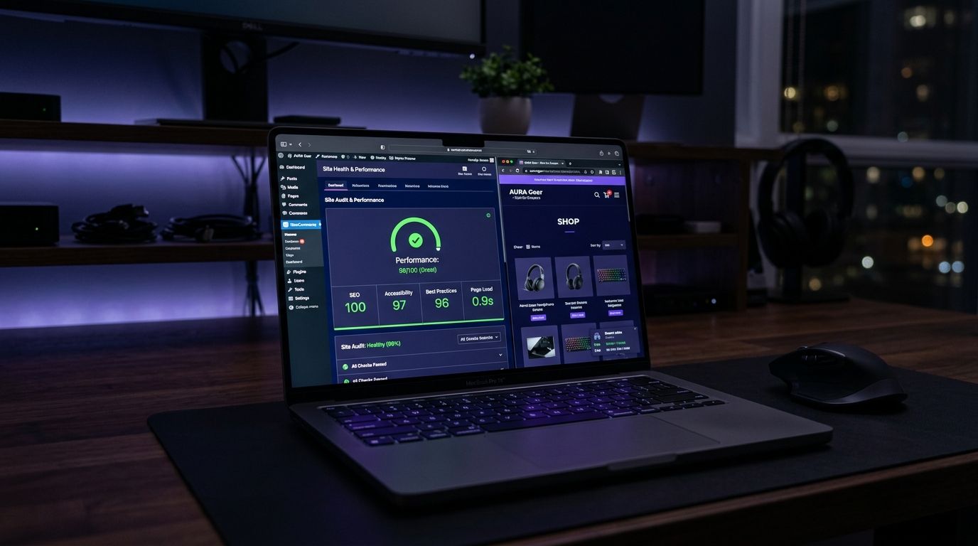
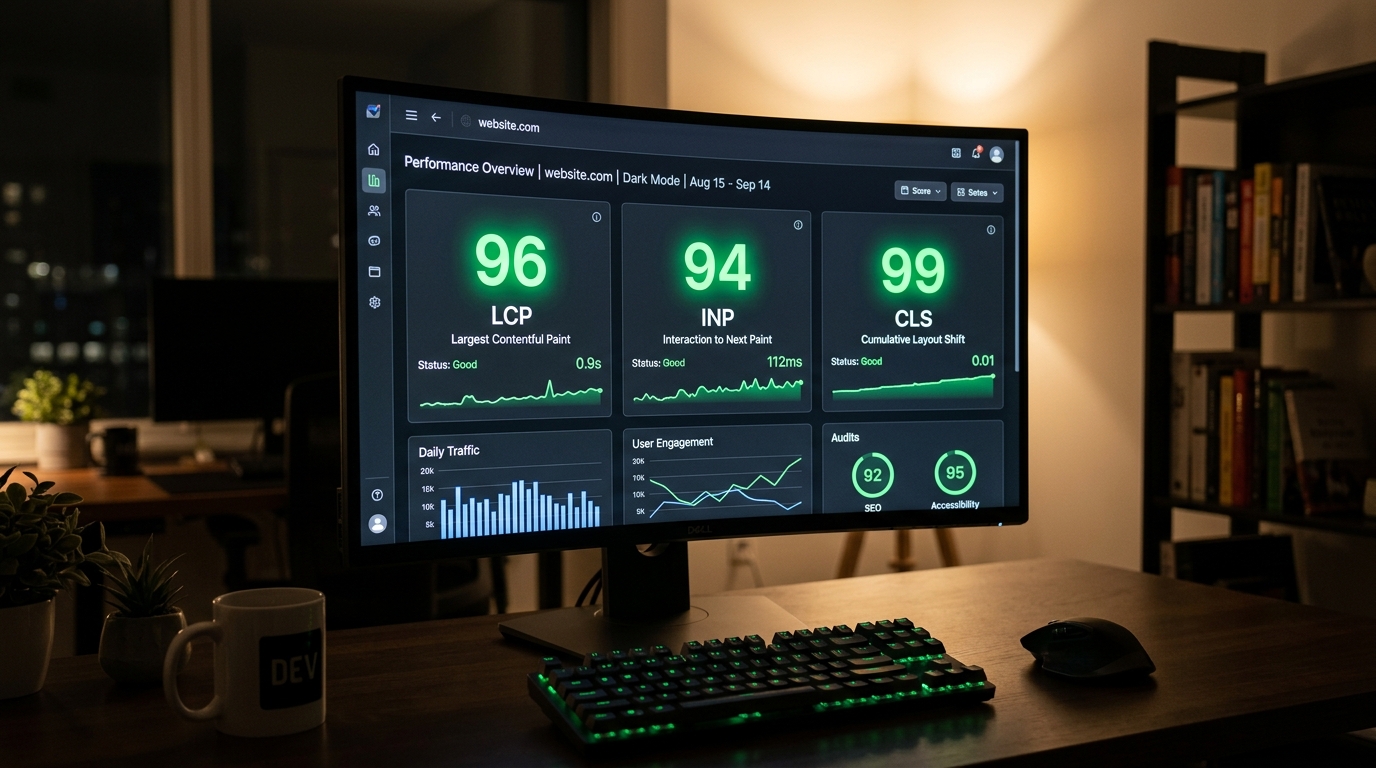
Landing Page Speed Is a Conversion Factor, Not Just a Technical One
Every second of load time reduces your conversion rate. This is not a theory. Multiple studies across industries have confirmed that page speed and conversion rates are directly linked.
A landing page needs to load fast on mobile, above all else. In 2026, most paid traffic arrives on smartphones. If your page is not optimized for mobile load performance, you are paying for traffic and then sending it to a page that frustrates people before they even read the headline.
This is exactly why our landing page design service prioritizes performance engineering alongside design. Speed is part of the conversion strategy, not an afterthought.
When to Use a Landing Page vs. a Full Website
Landing pages are the right tool for specific, focused conversion goals: paid ad campaigns, product launches, service-specific lead generation, event registrations, and free offer downloads. They are not a replacement for your main website, which handles your broader brand presence, SEO, and multi-page user journeys.
If you are running paid traffic to your homepage, you are almost certainly underperforming. A dedicated landing page aligned to your ad audience will nearly always convert better than a general homepage.
Getting a Landing Page Built the Right Way
A high-converting landing page is not just a design task. It requires an understanding of your audience, your offer, your competitors, and the psychology behind the decision you are asking visitors to make.
At Vyntic Studio, we approach every landing page as a conversion system, not just a visual deliverable. If you want to discuss a landing page project, start a project with us and we will walk through your goals in detail.
You can also get a free audit of your current landing page if you already have one that is not performing the way you expected.
Final Thoughts
High-converting landing pages are not complicated, but they are deliberate. Every element earns its place by serving the conversion goal. When design, copy, speed, and trust signals all work together toward one clear action, the results follow. If your current page is not getting the results it should, the fix is rarely adding more to the page. It is almost always about being clearer, faster, and more focused.
Also useful: our guide to WordPress architecture for businesses building pages that need to scale without slowing down.